[Case study] Kohde for iZone, a Rinnai brand
A whole house of air conditioning, on a screen the size of a light switch
- HVAC wall controller
- Releasing shortly
- 2025, enhancement 2026
iZone builds ducted air conditioning and zone control for the Australian market. Navi is their wall controller. Everything a household does to its climate happens on a panel that has to sit flush in a wall, be read from across a room, and be understood by someone who never asked to learn an interface.
- Client
- iZone, a Rinnai brand, Australia
- My role
- Designer, concept through to build-ready
- Timeline
- 2025, premium enhancement 2026
- Status
- Releasing shortly
Context
A ducted system splits a house into zones. Each zone can be open or closed, set to a share of the airflow, and in some cases held at its own temperature. The controller has to expose all of that, plus the things people touch daily: power, set point, mode and fan speed.
The audience is everyone in the house. Somebody adjusts it on the way past, in the dark, with an armful of washing. Nobody reads a manual first, and there is no onboarding, no tooltip and no undo.
The constraint
The screen is fixed and it is small. The entry-level controller runs at 720 by 720 pixels, which is not much for something mounted on a wall and read from across a room. Navi sits in place of a light switch, so the frame was never a design variable. Everything had to fit inside it: power state, set point, mode, fan speed, and a zone list that can run to fourteen zones.
Fourteen zones, five controls and one temperature that has to be readable from across the room, on a panel that cannot get any bigger.
The frame also moved. It began square, changed to a rectangle partway through, then came back to square, which meant the layout had to survive being rebuilt more than once. A second constraint shaped the later work: the client was happy with the entry-level product and wanted a premium tier rather than a replacement. That meant lifting the design without losing the character customers already recognise, since the two products sit side by side in the same range.
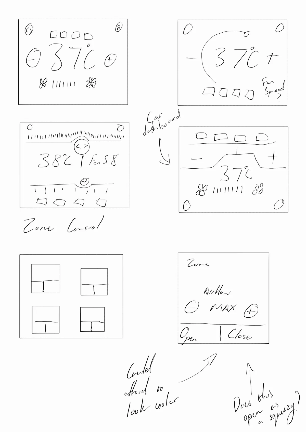
Starting on paper
It was quicker to work the layouts out on paper first. I sketched against the real frame ratio and wrote the open questions on the page instead of answering them early, which is how the car dashboard idea, the zone control grid and the airflow open and close model got compared before anything was drawn properly.
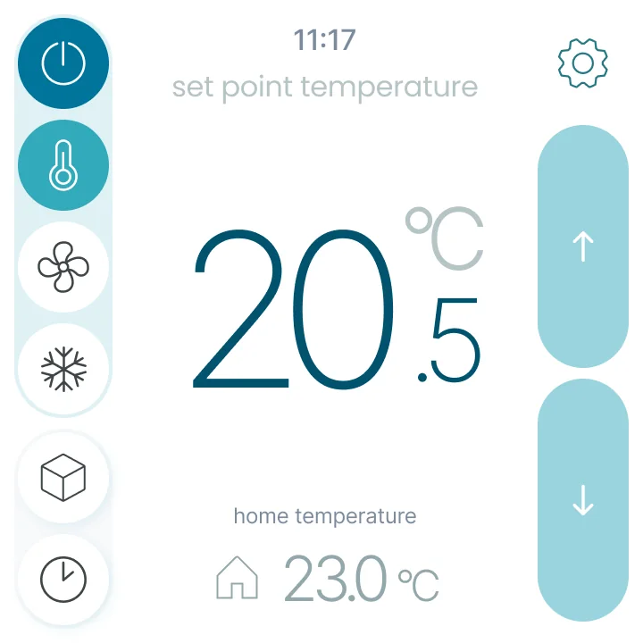
The shipping interface
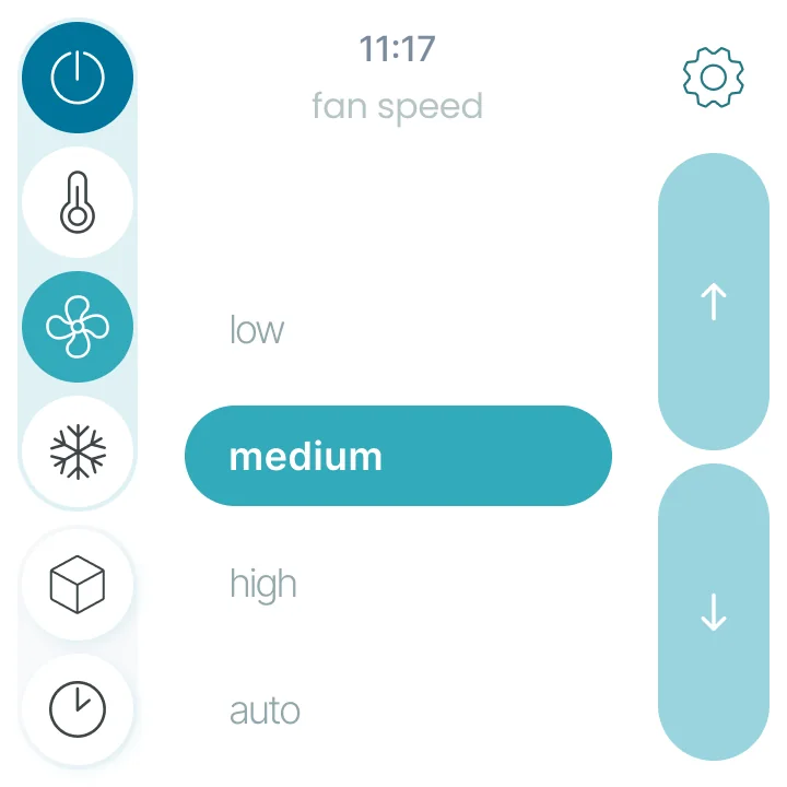
The resolved design gives up the middle of the screen entirely to the number that matters, and pushes everything else to the edges. A persistent icon rail on the left holds power, set point, fan, cooling mode, zones and scheduling. A pair of oversized capsules on the right does up and down, and nothing else.
Decisions
- One control area, many controls. The rail selects, the centre displays, the capsules adjust. Because that division never moves, learning one screen teaches all of them.
- Up and down get the largest targets on the panel. The two most-used controls on the panel got the largest, most forgiving hit areas, which matters when the interaction happens in passing rather than deliberately.
- Selected state carried by fill. A filled icon is easier to read at an angle in poor light than an outline is.
- Value and unit at different weights. Twenty point five degrees is read as one number from across a room and as a precise setting up close, so the decimal and the unit sit lighter than the whole degrees.
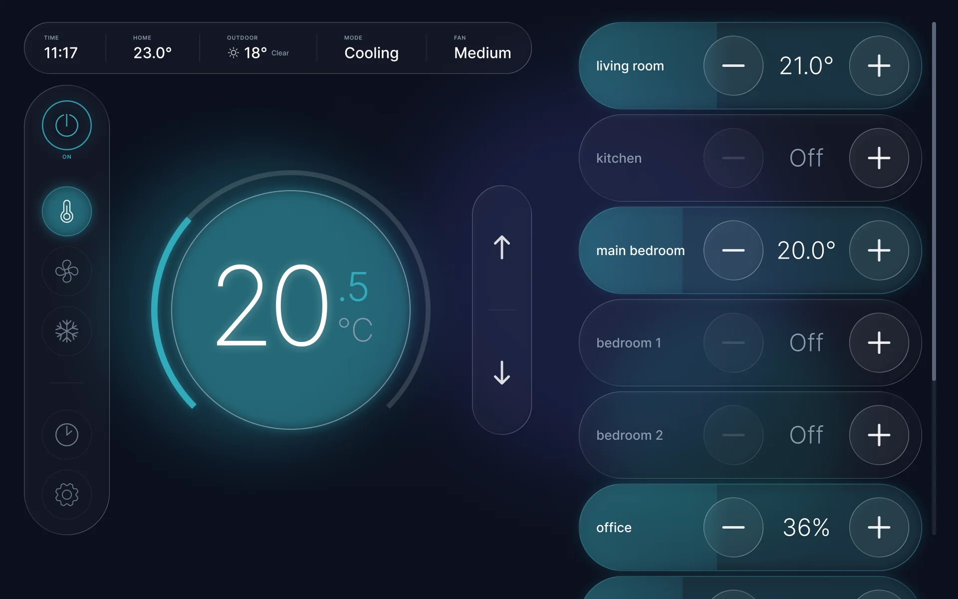
Navi Plus, the premium tier
The enhancement runs on a larger screen and had to feel like a step up rather than a different product. I researched premium controllers on the market, put three styling directions in front of the client, and took the chosen one through to componentised light and dark variants with pressed states for prototyping.
Decisions
- The arc came from one concept, the stepper from another. Rather than picking a direction whole, I kept the arc range scale from one and the capsule stepper from the shipping product, so the premium tier still reads as the same family.
- Zone rows use a continuous fill. A zone at 36% and a zone at 21 degrees are different quantities, and a continuous bar shows how open or how high without pretending to a precision the segments would imply.
- A zone row shows a percentage or a temperature, never both. Zones that hold their own temperature and zones that only take a share of airflow are different things, so the value changes rather than the row growing another control.
- The clock became an information strip. Time alone was not worth the space, so it now carries house temperature, outdoor conditions, mode and fan speed across the top, spanning from the rail to the up and down controls.
- Power state has to be unmistakable. The one thing a person must never get wrong at a glance is whether the system is running, so the power control carries its own colour and label rather than relying on a subtle state change.
What got cut
Two things were removed after they were drawn, which is worth recording because both looked reasonable on a desktop monitor and failed against the real screen.
- A cooling status pill in the top right, dropped for being too small to read at the distance people actually stand at.
- A bolder control variant with heavier buttons, dropped because it made the screen noisy. Only the up and down icons kept the extra size.
A flat editorial direction with hairline rules and no depth was also explored and set aside, as it was not what a premium tier needed to convey.
Outcome
- ReleasingFirst version of the new interface is at release
- 14 zonesSupported in one scrollable list without a second screen
- Two tiersEntry level and premium sharing one visual family
The work is componentised, with the glass and skeuomorphic treatments living as variants inside the same component set and pressed states wired for prototyping, so the client can vary the product without a redraw. I own the design direction for iZone across their range, which is why this reads as one system rather than two separate controllers.
Reflection
The first thing I would look at is the hit boxes. On a controller this small they were a real concern, and we did resolve them, but they are where I would start. The second is a workflow problem. iZone's supplier changed the screen size two or three times before landing back on the square through a different supplier, and each change meant a lot of back and forth. More auto layout and a smarter structure in the file would have made moving between sizes far less painful. The last one is visual. The original Navi is quite monotone, and it could be more interesting while keeping the same simple feel. Navi Plus was my attempt at that and I think it is a step in the right direction, though it could still be refined. I have recency bias on it, so that one needs more time before I trust my own judgement.